Mosaic is a thoughtfully reimagined private event space where modern design meets timeless character. Steps from the Chicago River, this venue hosts gatherings of all kinds. Inspired by the energy of DineAmic’s most beloved restaurants, Mosaic blends signature touches into an experience that feels curated and effortless.
I created the branding for Mosaic to reflect the minimal, earthy space, and chose simplistic and timeless design elements that would allow the adaptable nature of the event space to shine through. The patterns are inspired by Mosaic tiles and can be swapped out depending on the event. The header typeface, Fields, is chunky and unique, with just enough character to stand out. The subheader and copy typeface, Neue Haas Grotesque, works to balance the brand with its simplicity. And finally the script typeface, Classic Script, is an elegant addition that hints at the more refined capabilities of the space.
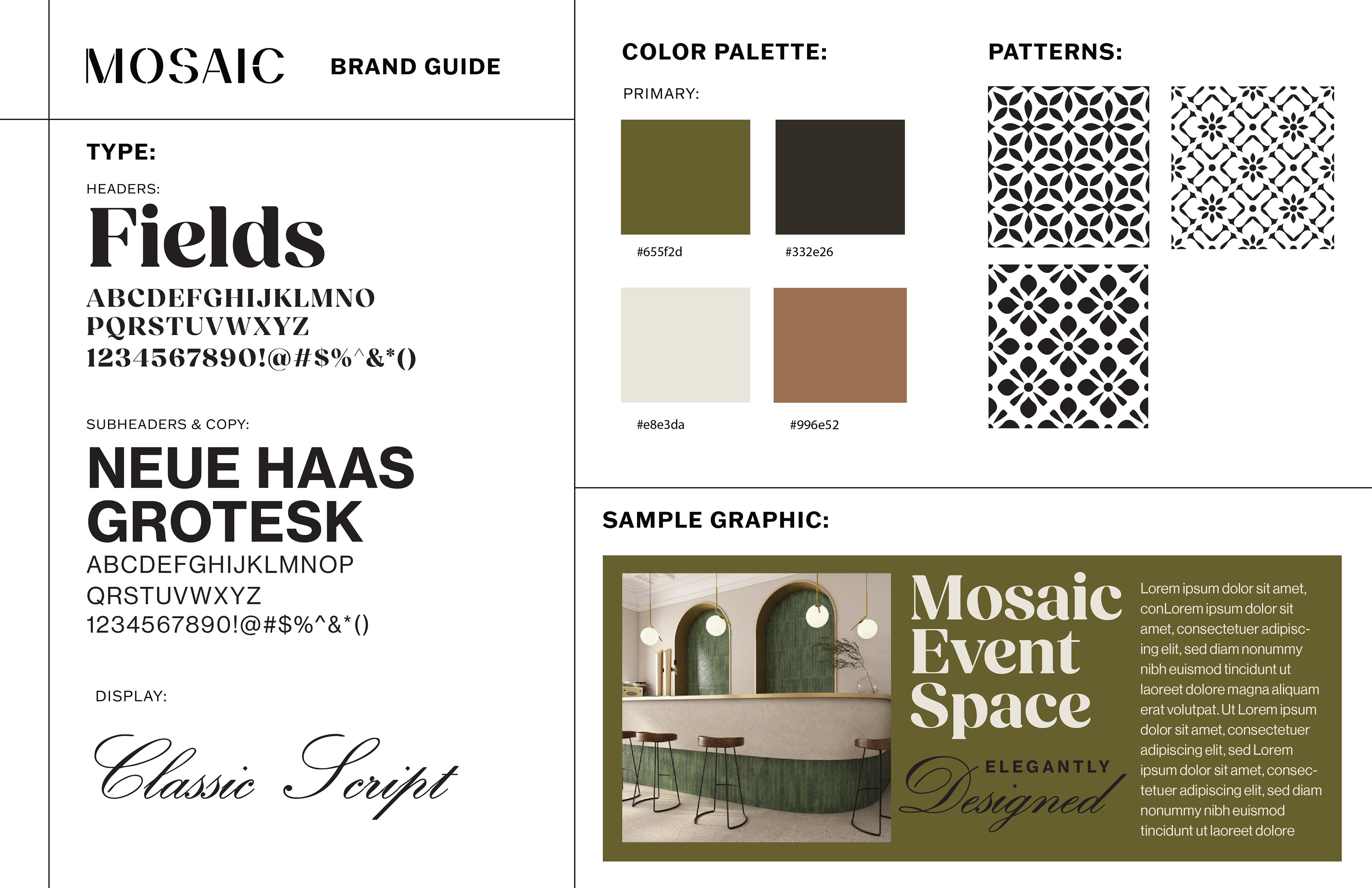
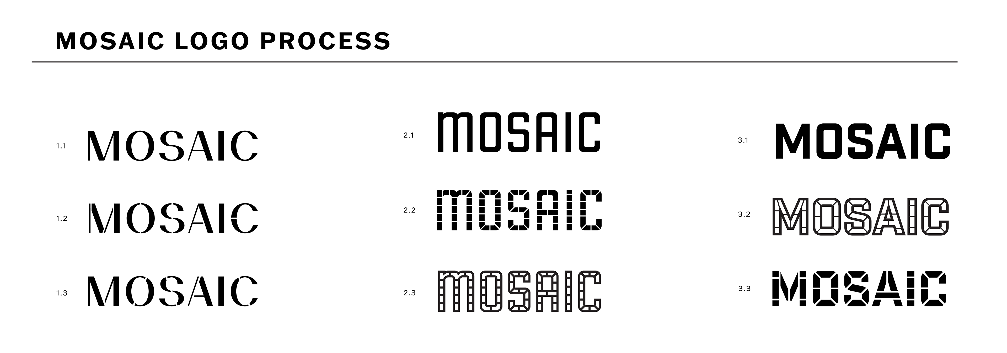
I worked with one of our partners to create the logo, which is a simplistic wordmark with just enough contrast to nod to the rustic space, with thin splicing through the letters as a more minimal mosaic tile representation. We also created two other final options that leaned into a more literal interpretation of the Mosaic namesake.
WEBSITE HOMEPAGE MOCK
